
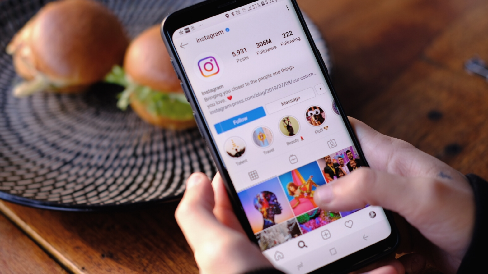
Picture this: You’ve just discovered a new brand that you love and decide to look them up on Instagram. But upon loading their page you find a bunch of poor quality images, mismatching text and no real theme at all. Would you want to follow them and have more of this type of content littering your feed? Probably not. Alternatively, how would you feel if you opened up their page to find a collection of beautifully edited photos, clear branding and a sense of flow throughout their grid? You would be much more inclined to follow them to see more, right?
Creating a visually appealing Instagram feed is extremely important as it can have a huge influence on whether or not somebody decides to follow you. If your feed is thoughtfully curated with cohesive colours and a strong theme it’s going to inspire people much more than a grid of thrown-together posts that don’t represent your brand. So how do you create such a feed?
Colours and Branding
Before even thinking about Instagram you want to make sure that your brand or business has a powerful identity. Think of companies such as Coca-Cola; they have a widely recognised logo and the colour red appears in all their products.
When deciding on your own branding, choose a few core colours that represent your business well and stick to those colours throughout your marketing. When it comes to your Instagram feed, these colours could be used for elements on your posts such as symbols and text. Take Point West’s own Instagram page for example – a few specific shades of blue are used sparingly for accents and icons to create consistency without being overwhelming.
When it comes to text you want to make sure you stick to the same fonts when creating your content. Choose a maximum of three fonts that you can use for your social media graphics. Keep it simple – make sure they are easy to read and reflect your brand’s identity (for example, don’t use a loopy, italic font when trying to convey a bold message!). If you want to know what fonts to avoid, here’s a list of no-gos!
Aesthetic
The overall aesthetic of your feed should be visually appealing and reflect your brand’s personality. Do you want your page to appear bright and summery? Or do you want a dark, mysterious feed? Take a look at some other accounts you admire to get some inspiration for the type of aesthetic that would fit well on your own Instagram page. You don’t want all your posts to look the same of course, as you want to give your followers variety. But by sticking to a general vibe it’s going to make your overall feed not only more attractive but will give new visitors an immediate idea of what you’re all about.
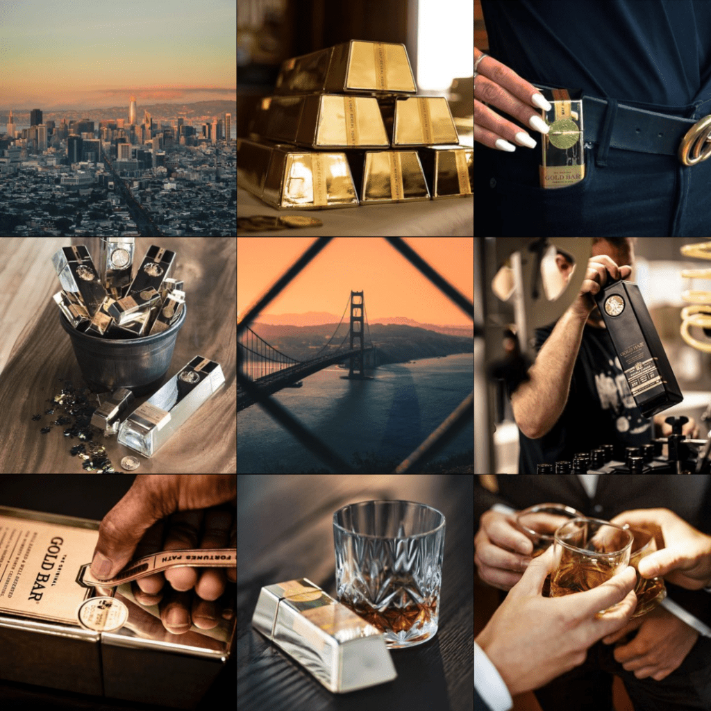
A great example is @goldbarwhiskey. Although they share a huge variety of images, from cityscapes to crystal glasses, their overall feed has a fairly dark and sophisticated appearance, suggesting that they are a luxury brand.
When taking photos or sourcing stock images for your feed it’s important to take your aesthetic into account. If you like a lot of empty, neutral space in your pictures don’t take photos with busy, colourful backgrounds. Similarly, if your feed is mostly pastel blues and pinks, you don’t want to be using images with lots of green grass in them!
Tip: When sourcing stock images make sure you get them from a legitimate source rather than just downloading from a google search. You want your images to be high quality and royalty-free. Unsplash is a great site for free stock photos, as is Canva if you have a pro membership.
Editing Photos
Taking great photos is of course vital, but editing them in the right way is important too and can really help to create a consistent vibe throughout your feed. Adobe Lightroom has a free mobile app that you can use to adjust and enhance the tones and colours in your photo to get them just how you want them. Not only that, you can download or create your own presets so that you can edit all your photos with one click to instantly get them looking consistent and professional.
Planning Your Grid in Advance
Instead of just posting your photo and crossing your fingers that it looks OK there are a ton of great apps and websites that allow you to view how photos will look in your feed before you’ve even posted them. Apps like Preview are really handy for this, and Later have their own planning and scheduling tool too. You can add your photos and shuffle them around to make sure they match your aesthetic and to decide on a layout.
You want to make sure you’re providing your followers with fresh content and avoiding a repetitive and cluttered feed, so keep similar posts spaced apart a little and pay attention to the details of each individual content piece. Don’t post a load of promotional, text-heavy images right next to each other – mix them up with personal and behind the scenes shots, for example, to keep your feed appealing and your followers engaged.
Your Instagram feed is important, but making it stand out doesn’t need to be a difficult task. Stick to these easy tips and you’ll soon have a beautiful page that will stop people in their tracks and have them coming back for more.
